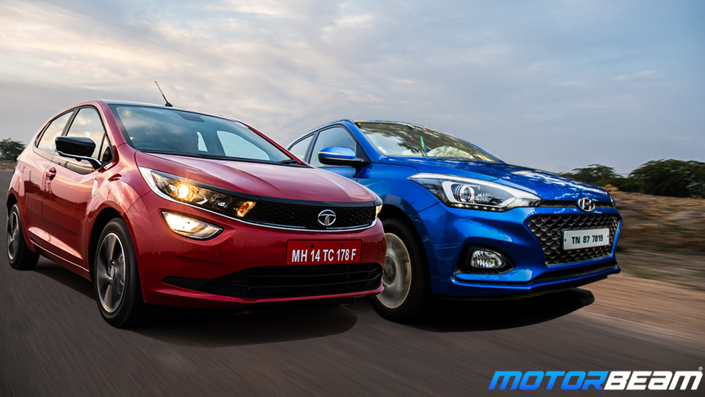
When Infotainment Systems Become Big
Honestly, we will have to thank Tesla for this revelation. Since the debut of that massive 17-inch infotainment system in 2012 via the Model S, everybody took a page from Tesla’s book and started making bigger and bigger infotainment systems. Nowadays, the minimum size of these systems itself is 7-inches, that too in budget cars. Move up the order, and this size keeps increasing. This is not a bad thing until you realise what these companies do with all of that extra screen real estate.
Distractions
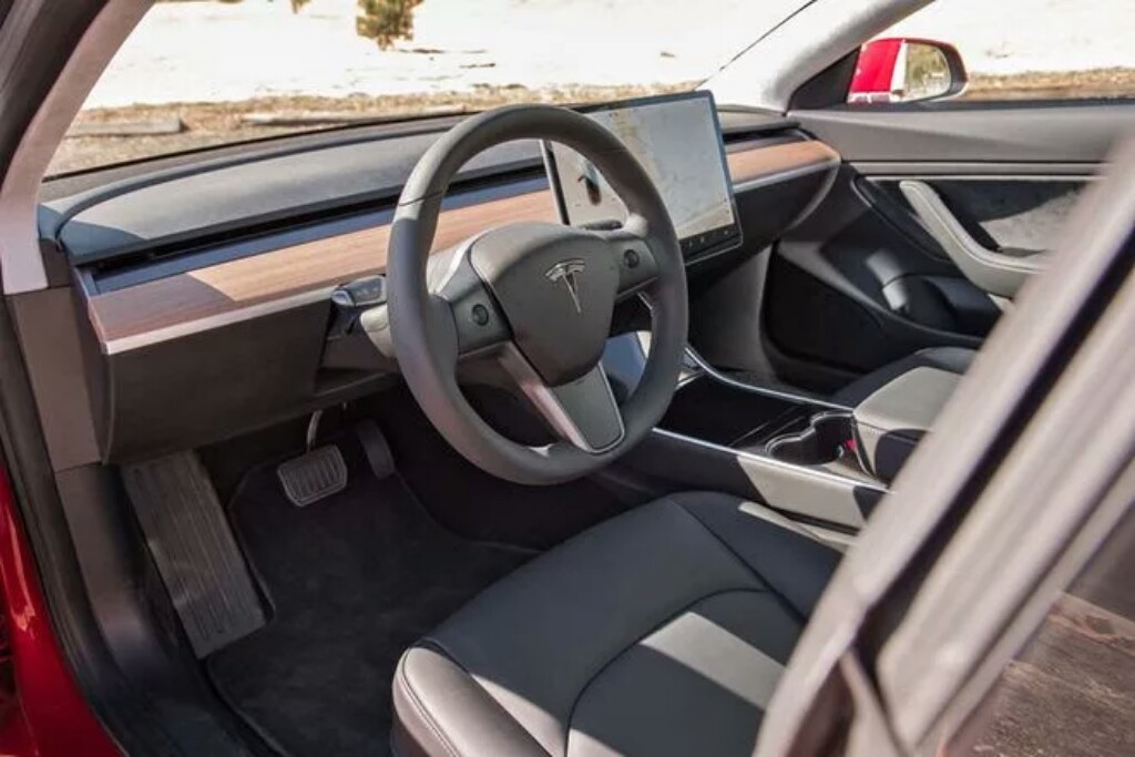
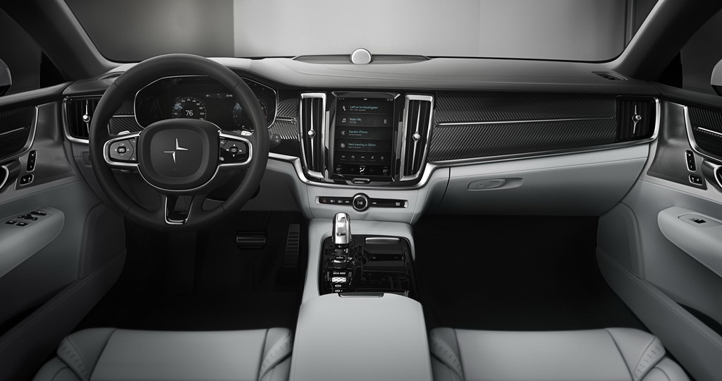
These huge screens take the space of buttons and dials and replace them with icons. First of all these on-screen “buttons” are a pain to hit while driving, and they start becoming distracting. Want to increase the volume? Software slider! Need to change the temperature? Software slider! In some cases, even headlight controls are placed under a menu in the infotainment.
Things like steering mounted audio controls exist so that the driver does not need to take their eyes off the road to change things. Adding all such innovative features only to make the climate control a page in the infotainment system is a step backward in terms of intuitiveness.
But do note that in some examples this has been somewhat taken care of with haptic response. Screens scream for attention, something you can’t afford to give when you have to focus on the road. Again, when they are properly sized, they stay out of the way when needed, but the big ones don’t.